Winning a photo contest both is and isn't a big deal. It isn't a big deal in the sense that a real artist would care more about expressing his or her idea and less about the audience reaction. On the other hand, I believe that art is a form of communication that becomes perfected when it is received by another person in a meeting of minds.
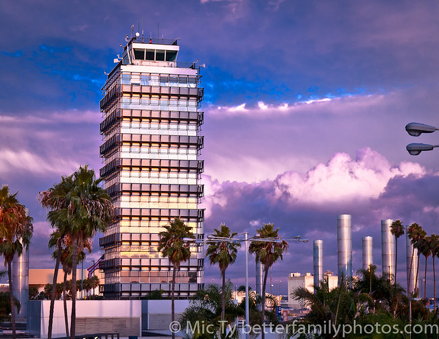
I entered the shot above in a photo contest and it was one of the winning entries. This is the second year in a row when I've had a winning entry in this contest and I thought I'd talk about the approach I used in making this photo.
Ideally, I would like my photo to be something that is worth looking at. It's not enough to be beautiful if it's something that has been done before.
There are amazing photos that simply demand attention because everything comes together perfectly. For example, while hiking in the mountains, you capture a scene where dramatic clouds have crepuscular rays shining through them, illuminating a colorful and picturesque town in a valley with a vast field of green grass, with colorful flowers in the foreground, complete with butterflies. And there's a triple rainbow in the background. If you get a miraculous scene like that, then obviously that shot would win any contest where that photo falls within the theme.
Most of the time though, I'm working with a mundane subject that people have already seen many times before and I have to work hard to make the shot deserve another look.
First, I make sure that the photo doesn't have any defects. By defect, I mean anything that detracts from the photo, such as a distracting object in the background.
Second, I make sure to control the most significant aspects of most photos: composition, lighting, exposure and color. If any of those fundamental aspects are less than good, then the shot likely will not meet the required threshold.
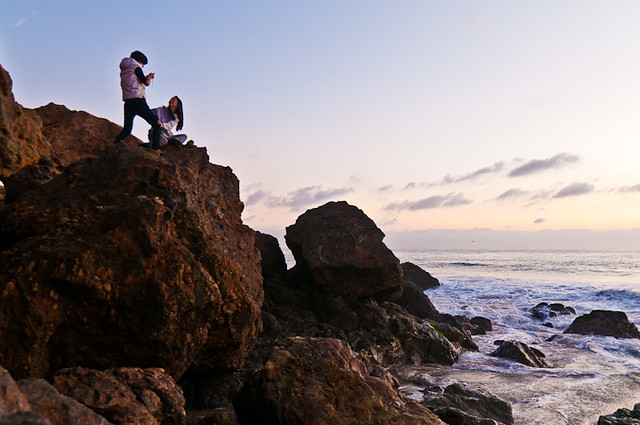
Third, if possible I try to have a strong secondary element in the shot. All photos have a primary subject or theme. However, I try to make the photo so that it has a secondary element or theme that is also worthy of attention. For example, a photo could on its face be a portrait but the background is itself an interesting subject.
 |
| Is it a candid portrait or is it a landscape photo? It's both! |
- a beautiful subject
- an exotic location
- a powerful facial expression
- an interesting or unusual point-of-view
- perfect timing
- amazing texture
- amazing details
- interesting shadows
- humor
EXAMPLE
The shot above is of one of the buildings at Los Angeles International Airport. I thought about shooting it at sunset while there were dramatic clouds in the sky (not so common in the dry Southern California weather). Finally, there was a storm that created the conditions for dramatic clouds. For this shot, I used my Nikon D300 and the versatile Tamron 17-50 2.8 VC.
Minimizing distractions: When I got to the spot where I wanted to take a shot, I looked for the best vantage point with the fewest street lamps and trees. At the time I was taking the shot there were also crows flying around. The crows were not appropriate for the photo so I waited for the crows to fly away before taking the shot.
Composition: I chose a slightly longer focal length (75mm equivalent) to make the clouds appear a little larger than normal (relative to the building) and to get fewer street lamps and palm trees in the shot. See here. In framing the shot I placed the building according to the rule of thirds. I waited for picturesque clouds to move into the background to complement the subject.
Exposure: Exposure can have a couple of meanings for me. First, it means the overall exposure value chosen. In that regard, important highlights and shadows should be retained. Second, it means the selection of aperture, shutter speed and ISO within the same exposure value in order to achieve the best results. I selected an aperture of f/11 to give me deep depth of field (to keep the building and clouds sharp). At f/16 I become concerned about diffraction. I also focused not at the building, but at a point that was closer (around the closer streetlamp), in order to maximize depth of field with the hyperfocal distance. I chose the base ISO for lowest noise (according to pixel peepers, ISO 160 is the real base ISO for the Nikon D300). I selected a shutter speed to get an exposure value that would retain details in the highlights of the clouds. That turned out to be 1/13. That's pretty slow but I wasn't concerned because I was using a tripod.
Lighting: I chose to take the photo while there were cloudy skies, instead of harsh direct sunlight that would have made the building washed out. There was also one other lighting decision as discussed below.
Color: To get the most intense colors in the clouds, I waited for the last rays of sunset to hit the clouds. The other thing I did for color is to change the white balance. I altered the color temperature and tint to get the colors in the shot.
Secondary Element: The literal subject of the photo is the building. However, another significant secondary element is the clouds. Without the clouds, this photo would look just like any other of the hundreds of photos of this building.
Special Effects: Here are the points I was able to put together for this photo (some already referenced previously).
1. Golden hour.
2. Dramatic clouds.
3. Interesting reflection. I caught the sunset in the reflection of the building.
4. Contrasting light conditions. The reflection of the building here is facing west. As the sun began to set, west of this building, the clouds were already in dusk. Because of the reflection, two different "time zones" with distinct light conditions were captured in the shot.
5. Spotlight. I waited until the clouds overhead parted slightly to shine a "spotlight" on the building (that's why the left part of the building is brighter than the right part). This not only highlighted the building but allowed me to get a darker exposure for the clouds (relative to the sunlight), making the clouds even more dramatic.
So there you have it!
RELATED POSTS
What's the point of having different lenses?
Environmental Portrait: Go Short or Long?
Brushing the Sky
Mitchell Kanashkevich's Captivating Color
Congratulations on your win, this is a very nice photo, the effort alone deserves the win. :-)
ReplyDeleteThanks my friend!
ReplyDelete