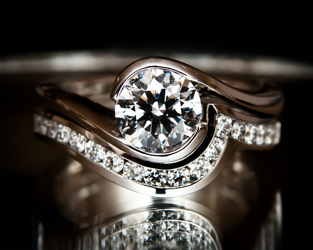
How do you make something appear more brilliant? It may seem that adding more light would be the solution. If more light is reflected, wouldn't that mean that the object is more brilliant by definition?
Sometimes, to make an object appear more brilliant, what we need is more shadow (or specifically contrast) instead of more light. Take a look at the comparison shots below. It's not a perfect comparison but it illustrates the point:
(BTW both photos are of the same ring. The left test shot was taken with a Sigma 50-150 then cropped. The right one was taken with a Nikon 28-105 f/3.5-4.5 AF-D. Both were processed with very similar settings in Lightroom 3.)
If you look at the diamond on the right shot, it shows more dark areas. No light is being returned from those dark areas. On the left-hand shot, there are fewer dark areas - mostly highlights and grays. We can infer that more light was returned on the lefthand shot. However, the righthand shot appears more "brilliant" because it has greater contrast.
Indeed in the diamond industry, the brilliance of a diamond is analyzed in terms of not just its brightness but just as importantly, its contrast. See here.
When taking shots of diamonds specifically, the maximum contrast is when the diamond is viewed straight-on. That's because your head and the camera will block some of the light, and the shadow can be seen in some round diamonds as an eight-pointed star.
For other subjects, just keep in mind that sometimes, to make an object appear brighter, you need not just brightness but contrast (e.g. from shadows) as well.

You demonstrated a very critical point regarding photography in general, shadows are what define your subject and gives it depth. The final result looks very good and sharp.
ReplyDeleteHowever, in the comparison photos, the left photo is out of focus which makes the comparison less obvious.
Yeah the left pic is oof so it's not as obvious a comparison. When I have the time, I'll reshoot that. Thanks!
ReplyDelete