Showing posts with label contrast. Show all posts

Friday, September 23, 2011

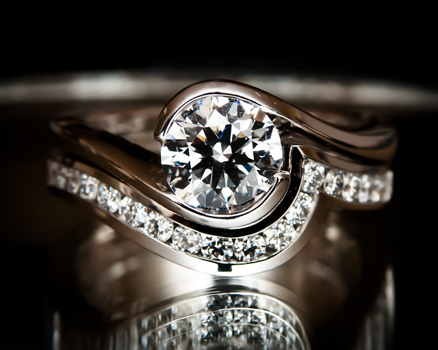
Maximum Brilliance

Brilliance

How do you make something appear more brilliant?  It may seem that adding more light would be the solution.  If more light is reflected, wouldn't that mean that the object is more brilliant by definition?

Sunday, October 3, 2010

Rescuing an Overexposed Image and Decreasing Contrast (Basic)

_DSC2909edited

This weekend we went to the Aquarium of the Pacific in Long Beach, CA.  I took the shot above as our toddler (in green shirt) was watching seals in amazement.  I was on manual exposure mode and I exposed for the aquarium then used bounce flash to illuminate our toddler.  Due to the strong ambient light illuminating the water (relative to the dark exhibit), I set the shutter to sync speed (1/250) right away.  I was bouncing flash from dark ceilings so I set ISO at 800, then adjusted aperture until the light meter showed around -0.3 (which turned out to be f/6.3).  I figured that would give me an acceptable tone for the bright aquarium.  If the aquarium were exposed much darker than that I had doubts that I would have enough power for bounce flash.  I didn't have time to take a test shot and I just activated the flash on TTL with -0.3 FEC.

Here is how the shot looked like originally:

Argh! Horribly overexposed.  I think what happened was that TTL-BL tried to match the comparatively bright light in the aquarium with an equally bright flash exposure, resulting in flash overexposure (as well as overexposure).  In retrospect I should have used f/8 or maybe even narrower than that, or lowered the ISO to 400 or so.  The aquarium would have looked less overexposed, and it appears that the flash would have had enough power to illuminate our toddler (or at least not make him look like a silhouette).  If I had all the time in the world, I could have used the flash in manual mode at full power then chimped to find the lowest ISO and minimum aperture I could get away with (as long as it's sufficient exposure for the water).

Anyway, no problem - during raw processing, I can recover at least 1 stop (if not more), right?  Well, unfortunately, it so happened that I had been doing some test shots the other day and had left the camera in JPEG mode... doh!

I wanted to try to rescue the photo though.  Here are the things I did (I used Corel Paintshop Photo Pro X3):
1. I duplicated the background layer and changed the blend mode of the duplicate layer to multiply.  This will make the image look less overexposed but will also make it look contrasty, which we'll address later.  Note also that this isn't going to recover totally blown pixels.

2. To make the light rays more visible and increase the contrast in the water, I applied local tone mapping.
 
3. Local tone mapping will reduce the saturation.  To compensate, I increased vibrancy.  Vibrancy differs from saturation in a couple of ways: vibrancy doesn't affect skin tones so much, and vibrancy has less effect on already saturated areas (whereas saturation affects all areas uniformly).
4. Because of the multiply plus the local tone mapping, the contrast was really high.  To counteract this, I first created a levels adjustment and moved the midtone a bit to the left.  This changes some shadows into midtones.  Next, to bring down contrast, I created a curves adjustment layer with a reverse S-curve (see below).  I wanted to keep the increased contrast in the water, so I used layer masking to apply the decrease in contrast only to the kids and the highlights on the seals.


Reducing contrast using a curves adjustment this way is better in my view than simply decreasing contrast.  What decreasing contrast does is to squeeze the histogram, resulting in less dark shadows and less bright highlights.  The problem is that blacks start looking grayish, and the image loses its punch.  Here is a comparison with the same layer masking used for the contrast adjustment (check out our toddler's hair):

I did a few more tweaks after that such as bringing down the exposure in a few areas (kinda like burning).  Final result again for convenience:
_DSC2909edited

 I'm no photoshop expert so if you have better suggestions, please feel free to share in the comments below! :D
Tuesday, August 10, 2010

Quality vs. Contrast: Soft Light Ain't All That (Intermediate)


When starting with lighting education, the typical response to unflattering shadows is to seek a softer light source (with less defined shadows). Of course, a soft light source will be more forgiving and many people look better with soft light. However, in my view, soft light by itself is helpful but is not the answer. I suggest instead to emphasize controlling the contrast between highlight and shadow.

To illustrate the difference between these two approaches (quality vs. contrast), check out this test shot:

How does it feel? Except for dramatic purposes, it is not a look that most people seek for portraits. Yet this is a photo with a soft light source. Don't believe me? I agree it sure doesn't look like it is a photo with soft light. However, check out the shadows on the wall. The evidence is right there - shadow edges are blurred - the definition of soft light.

Now, check out the shot above, reproduced here for convenience:


How does it compare to the soft light photo above? It's still edgy (intentionally so) but has a much more mainstream look than the soft light photo above. The shot was done with an SB-800 flash, a popup flash, and of course ambient light.  The flashes were bare.  No umbrella, no softbox, no modifiers, no postprocessing. Check the shadow of the nose or the shadow of the shirt sleeve on the left arm (zoom in if needed). The shadows have a well-defined edge - evidence that hard light was used.

To make the shot work though, I controlled the contrast between highlight and shadow - not letting it get too high. If I recall, I intentionally underexposed the ambient light by about 1 stop. The SB-800 was on TTL, about 1 stop underexposed. My rationale was that with the ambient at 50% of what it should be, and the SB-800 at 50% of what it should be, both would add up to the correct exposure - except that I've controlled the direction of the light. [Note: flash blur is a risk when flash and ambient are equal in intensity but here the shutter speed was 1/250 - therefore any flash blur would not be noticeable.] The popup flash was acting as fill, about 2 stops underexposed if I recall. The purpose was to work with the (underexposed) ambient light to bring up any shadows. If I wanted a less dramatic look I could have increased the intensity of the popup flash instead (e.g., FEC -1.3), which would reduce the highlight-shadow contrast.

The above shots illustrate why in my view, controlling contrast can have more positive impact on your photo than the quality of the light. Fortunately, we don't have to choose one or the other exclusively - we can use both. However, I wanted to make the point that contrast is arguably more important than the quality of the light.

BTW, controlling contrast doesn't necessarily require another flash. For example, we can use reflectors or ambient light as fill.  To learn how to control contrast, please check out the TTL Flash Tutorial (especially Part 2). :)

Related article: simulating soft light with a hard light source.

UPDATE I found a related Strobist.com article (with much better photos!): http://strobist.blogspot.com/2008/10/on-axis-fill-ring-fill-against.html  -- Although David Hobby used a hard and even restricted key light, the photos don't look harsh at all. Instead, they look a bit edgy but pleasant, at least in part due to careful control of the ratios between key, fill and ambient.