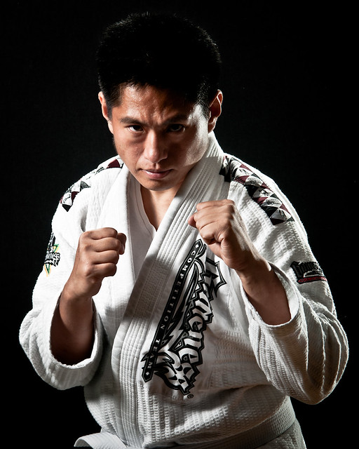
I'm a fan of UFC (Ultimate Fighting Championship) and decided to do a UFC-style portrait for fun.
I became a UFC (Ultimate Fighting Championship) fan many years ago when I watched a relatively thin and ordinary-looking guy named Royce Gracie take on muscular martial artists and streetfighters who weighed far more than he did in no-holds-barred matches and somehow win. What most people did not know then was that Royce was a master of Brazilian Jiu-Jitsu (BJJ), a martial art that recognized that most fights ended up on the ground, where a fighter skilled with grappling could dominate an otherwise fearsome opponent who was unfamiliar with groundfighting. Almost two decades since Royce Gracie brought BJJ to prominence with his shocking success, BJJ still remains one of the most dominant fighting styles in the UFC.
Recently, I started learning BJJ to improve my fitness (gym is just too boring for me). BJJ has been both challenging and fun. While a match between a BJJ fighter and a traditional martial artist is interesting to watch, a battle between two skilled BJJ fighters is even more fascinating because of the depth of strategy and techniques involved. It has been described as physical chess and I have to say that's not an exaggeration. It is truly a beautiful mixture of science and art, just like photography.
Anyway, I decided to do a photo in the style of many UFC event posters, such as this one:
 |
| image credit: UFC and Zuffa, LLC |
No way I was going to show my flabby muscles, so instead I donned my gi (the uniform we use in BJJ). First, I selected my key light -- an Alien Bees B1600 in a 24-inch softbox, placed to camera left. The B1600 was triggered by a CyberCommander. Behind me was a black popup background.
 |
| test shot: key light only |
Next I added a separation light above and behind me. I used an SB-26, triggered by a Radiopopper JrX Studio.
 |
| 2nd test shot: key + separation light |
Finally, I added an accent light camera right. It was an SB-80 in optical slave mode, Justin-clamped to a floor lamp. In retrospect I would have liked to place it higher except I didn't have the space for a light stand.
 |
| 3rd test shot: key only |
 |
| 4th test shot: key + accent light (no separation light) |
Finally I got into character one more time and took the final shot...
 |
| Let's Get Ready to Rumble!!! |
BTW, I will be posting a review of the CyberCommander soon, as well as how I combined it with the Radiopopper JrX. I will also post a review of the popup background I used.


Nice shot and nice details on the lighting process, it looks intimidating. I followed a similar process when I was testing the softbox, I took several shots with different lights on and off, I hope to post about it soon.
ReplyDelete